Professional Logo Design Services for Businesses
DesignBub creates custom logos for startups, established businesses, product brands, ecommerce stores and professional companies. We build clear marks, wordmarks, monograms and flexible logo systems that stay practical across websites, print, packaging, signage and small digital spaces.
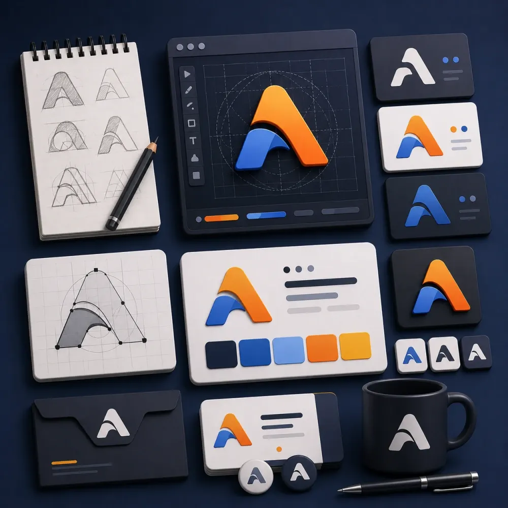
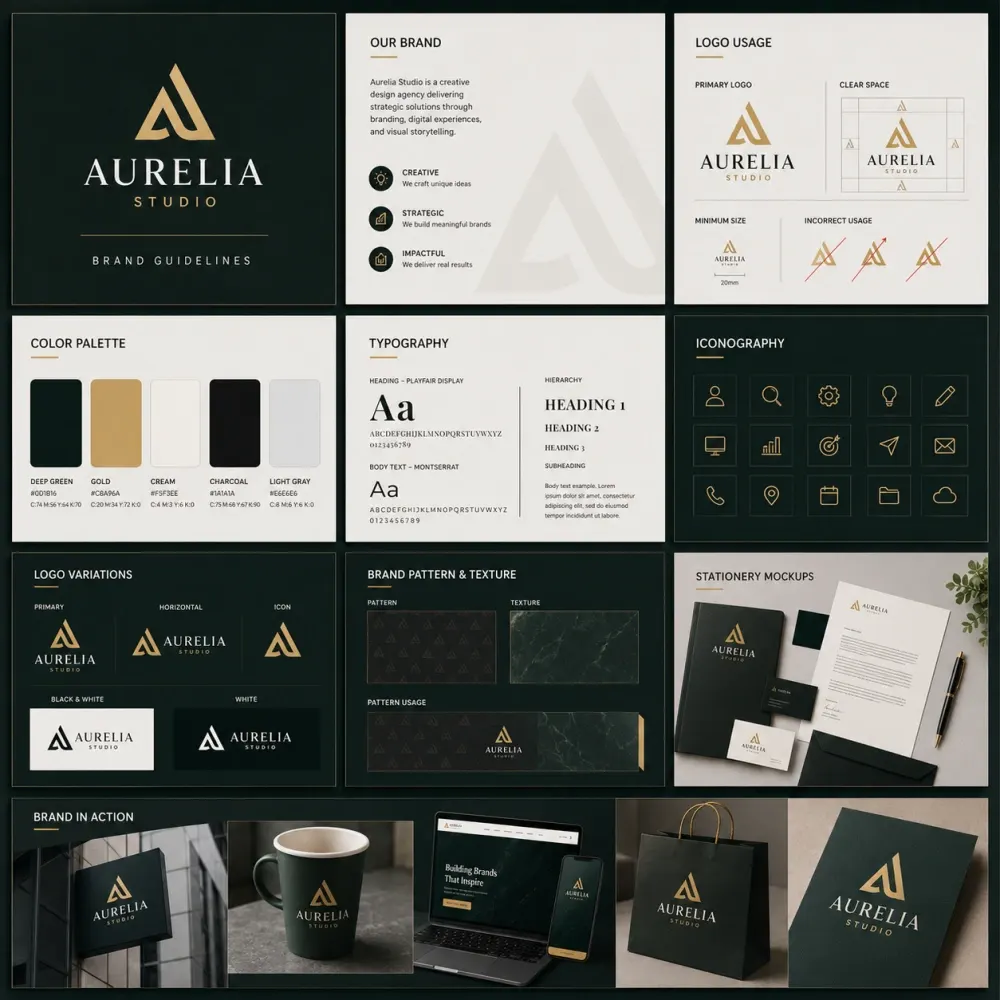
Original logo directions built for recognition, scale and practical use instead of presentation-only effects.






















A small visual mark has to survive a surprisingly large number of places.
A logo often becomes the smallest part of a brand that people see most often. It can appear on a website header, product label, social profile, business card, shop sign, invoice, app icon, uniform, vehicle or presentation. In some places, the logo has room to breathe. In others, it may appear at the size of a thumbnail.
That is why logo design needs more than a shape that looks attractive on one screen. The mark has to stay clear at different sizes. It should fit the tone of the business. It should work in color and in one-color use. It needs a structure that another designer, printer or developer can apply without guessing.
DesignBub provides logo design services for startups, established businesses, product brands, professional firms, ecommerce stores, restaurants, construction companies, technology companies and organizations that need a clear visual starting point.
We create wordmarks, lettermarks, symbols, combination logos, monograms, emblem-style marks and flexible logo systems. We begin with the business rather than with decoration: what the company does, who needs to recognize it, where the mark will appear, what tone it needs to carry and which visual ideas should be avoided.
A strong logo should make the business easier to recognize. It should not make people solve a visual puzzle before they understand the name.
What a professional logo project can include.
Our logo design services shape the scope around the stage of the business, the type of mark it needs and the places where the approved identity will be used.
Strategy & Direction
Review the business name, audience, category, personality and practical logo uses before concepts begin.
Original Concepts
Develop distinct creative directions rather than presenting small color or font changes as separate ideas.
Logo Variations
Prepare useful horizontal, stacked, icon and one-color versions when the selected package includes them.
Final File System
Organize scalable vector artwork and common digital exports so the approved mark is practical after handoff.
Start with the business position before sketching symbols.
Good logo design becomes easier when the business has a clear position. We first look at the company name, offer, audience, category and intended personality before deciding whether the logo should lead with the name, a symbol or both.
A long name may need a strong wordmark and a shorter icon. A company with several divisions may need a simple master structure that can sit beside different sub-brand names.
We also review common category patterns so the final mark can feel specific without trying to be different at any cost.
Build the mark around the business instead of changing text inside a template.
Custom logo design can begin with typography, geometry, letter shapes, an abstract idea or a visual cue that genuinely connects to the brand. The concept should still make sense when the final mark becomes simple.
Simple does not mean generic. A well-built simple logo often comes from careful decisions about proportions, spacing, letterforms and shape relationships. We refine those details so the mark feels intentional rather than unfinished.
The final logo should also avoid depending on one fashionable effect. Gradients, 3D mockups and lighting can help present a direction, but the core mark still needs to work when those effects disappear. That gives the business a logo it can use across more media and production methods.
Choose a structure that solves a real identity problem.
Different businesses need different logo structures. We select the form around name length, recognition needs and practical use instead of treating one style as universally better.
Wordmark Logo Design
A wordmark uses the business name as the main visual element. We can customize letter shapes, spacing and proportions so the name has a more ownable character while staying readable.
Lettermark & Monogram
Initial-based marks suit long names and compact applications. We explore custom construction without making the letters so clever that customers cannot read them.
Symbol & Icon
A standalone symbol can become a useful compact signature. We avoid obvious category clichés unless a familiar idea has a clear reason to be part of the brand.
Combination Mark
A symbol plus wordmark gives a new brand flexibility because the name remains visible while the icon starts building recognition.
Let the business name carry the identity when the name itself is the strongest asset.
A wordmark can work especially well when the company name is distinctive. The design depends heavily on typography, spacing and the relationship between individual letters. We may customize selected characters, adjust proportions or build a lettering direction that fits the tone of the business.
A law firm may need a different voice from a children's brand. A technology company may need a different structure from a restaurant. We choose the type direction around the business instead of using the same visual formula across industries.
Long names also need testing in narrow spaces. A secondary stacked arrangement or compact icon may help when the full wordmark becomes too wide for mobile headers, profile images or small labels.
Keep compact marks understandable even when the available space becomes small.
Lettermarks and monograms can give long business names a shorter visual signature. We can explore custom construction, overlap, negative space and geometric relationships, but readability stays important. A mark loses value when the audience cannot tell which letters it contains.
Symbols create another type of compact identity. They may be literal, abstract or built from part of the company name. We look for ideas that suit the business without automatically using the same roof, circuit, leaf or generic shield that appears throughout a category.
Once a compact mark is approved, we test it at smaller sizes because these versions often become favicons, social avatars, app icons, stamps and profile marks.
Give a new company room to grow without making the logo vague.
Startups often need a logo before the rest of the brand system exists. That makes early decisions important. The mark should support the current offer without locking the company into a narrow feature that may change as the product develops.
For SaaS, app and technology startups, small digital uses matter from the beginning. We consider browser favicons, app icons, navigation bars, social profiles and presentation covers alongside the normal full logo.
A startup logo can also include a small supporting color and type direction when the selected package calls for it. This gives the team enough visual structure to launch while leaving wider brand identity work for a later stage if needed.
Create a mark that can move through documents, signage and different business units.
Corporate logo design usually needs control, clarity and long-term usability. The mark may appear across proposals, reports, signage, presentations, uniforms, websites and official documents. We keep those environments in mind before approving delicate details that only work on screen.
For groups and holding companies, the logo may also need to support subsidiary names. In those cases, we can create a master structure that keeps the group identity visible while allowing business units to sit underneath it in a consistent way.
A corporate logo does not need to look conservative. It does need a system that multiple departments and vendors can use without changing the mark every time it appears.
Test the identity where customers will actually see the product.
Product brands need logos that survive packaging and digital retail. A mark may appear on a small label, bottle cap, pouch, carton, website, marketplace thumbnail and shipping material. We test the logo in those smaller contexts instead of judging it only on a large presentation board.
Thin lines, long taglines and complicated symbols can become difficult to reproduce. The logo also needs to work with product names and variant information rather than compete with them.
For ecommerce brands, profile icons and mobile headers matter too. We can create compact logo variations that keep recognition when the full wordmark becomes too wide. This gives the brand a practical identity across both physical products and online selling environments.
Match the mark to the experience customers expect.
Restaurants, cafes, bakeries and hotels use logos on menus, signs, packaging, uniforms and social profiles. A casual food brand needs a different visual voice from a fine-dining business, so we shape the typography and symbol around the real customer experience.
Small packaging, stamps and embroidery may need simplified artwork. When necessary, we prepare a compact version that keeps the identity recognizable at smaller sizes.
Communicate capability without repeating the same category symbols.
Construction, real estate, engineering and industrial logos often use buildings, roofs, tools or initials. We can use familiar ideas when they fit, but we look for a more specific treatment so the mark does not feel interchangeable with nearby competitors.
The approved logo should remain practical on site boards, helmets, vehicles, documents and digital platforms. Years of experience, awards or certifications only belong in supporting materials when the business has confirmed them.
Design for small interfaces without copying a generic software look.
Technology and SaaS logos often need to work inside website headers, dashboards, social profiles and app icons. We can pair a full wordmark with a compact symbol so the identity stays useful across those spaces.
We avoid adding circuit lines, gradients or other “tech” decoration without a reason. The visual direction should follow the product and audience rather than a stereotype of what software branding should look like.
Change what no longer works without throwing away recognition automatically.
A logo may need redesigning because the business changed, not because the old mark was completely wrong. The company may have grown into new services. The current logo may look dated, perform poorly on mobile screens or exist only as low-quality image files.
Logo redesign starts by identifying what still has value. A familiar color may be worth keeping. A recognizable letter shape may still support brand recognition. A symbol may only need simplification.
We can refresh the logo without removing every familiar element. For larger changes, we can create a new direction and explain how it differs from the previous mark. The correct level of change depends on how established the existing identity is.
Use letterforms to carry personality before adding decorative symbols.
Typography can define the personality of a logo before any symbol appears. Letter width, weight, shape and spacing all affect how the name feels. We choose type direction around the business rather than around the font that currently looks fashionable.
Some logos use an existing typeface with careful customization. Others need more extensive letterform work. We adjust spacing manually because default font spacing does not always create a balanced wordmark.
Licensing also matters. If a commercial font becomes part of the supporting identity, the business may need the appropriate license for wider use. Where possible, we explain which parts of the logo are custom artwork and which supporting typefaces may require separate licensing.
Make sure the logo still works when the full palette disappears.
Color can support recognition, but the logo should not depend on color alone. We usually test the mark in black and white before finalizing the full palette. If the structure only works because two similar shapes use different colors, it may fail in one-color printing or engraving.
Once the form is strong, we develop the color direction around the brand. A bright palette may suit an energetic consumer business. A quieter palette may fit a professional service. Some brands need stronger contrast for digital products or signage.
We can provide practical references such as HEX, RGB and CMYK values. Physical printing can still vary by paper, ink, material and production method, so exact physical matching may require a supplier proof or standardized spot color.
Prepare approved variations instead of forcing one lockup into every space.
A logo needs to work both large and small. Signage can reveal awkward spacing, while small icons can make fine details disappear. We test the design across realistic sizes before final delivery.
Some identities benefit from responsive variations: a full name and symbol for wide spaces, a shorter lockup for medium spaces, and a compact symbol or initials for small ones.
Each version should solve a real layout problem while remaining clearly part of the same identity.
Create original design work while keeping legal clearance in the right place.
We create original logo concepts for the client and do not use premade logo templates as the final mark. You can share references to communicate taste, but the final direction should not copy another company's symbol or lettering.
Original design work is not the same as legal trademark clearance. Similar names, symbols or marks may already exist in different markets. A professional trademark search can involve legal databases, classes and jurisdiction-specific review.
We can make sensible visual checks during the creative process, but we do not guarantee that a mark is legally available for registration. Businesses that plan to register a trademark should use the appropriate legal or trademark professional for formal clearance.
Leave the project with files your team can actually use.
A professional logo package should include files for both design and everyday use. Vector artwork allows the logo to scale without losing quality. Raster exports support websites, documents and social platforms.
Depending on the package, final deliverables can include AI, SVG, PDF, PNG and JPG files. We can also provide color, black, white and transparent-background versions. When several approved lockups exist, we organize them clearly so the team knows which version to use.
The business should not need to rebuild the logo from a screenshot later. Clear final files make it easier to work with printers, developers, marketers and future designers.
Move from business context to a refined visual signature.
Our process keeps the design focused while giving the client clear points to review the direction.
Discovery
Review the company name, offer, audience, competitors, existing branding and practical uses.
Creative Routes
Define useful logo structures, visual references and ideas before polishing concepts.
Concept Design
Create distinct logo concepts with attention to shape, spacing, typography and originality.
Refinement
Develop the selected direction through the revision rounds included in the chosen package.
Final Handoff
Prepare approved variations, color versions and file formats for real business use.
Choose the amount of exploration and logo system your business actually needs.
Our logo design services use clear starting packages in USD. The scope stays clear: concept count, revision rounds and deliverables change by package rather than using unlimited promises.
Logo Foundation
For a new or smaller business that needs a professional primary logo and essential production files.
- 3 original logo concepts
- 2 revision rounds on the selected direction
- Primary approved logo
- Black and white versions
- AI / SVG / PDF vector files
- PNG / JPG digital exports
- Basic color direction
Logo Professional
For businesses that need more concept exploration plus a practical set of logo variations for daily use.
- 5 original logo concepts
- 3 revision rounds
- Primary, horizontal and stacked lockups
- Compact icon / social profile version
- Color, black and white versions
- Complete vector and raster file set
- Compact logo usage sheet
Logo System
For brands that need wider creative exploration and a more complete logo family for several touchpoints.
- 7 original logo concepts
- 4 revision rounds
- Extended responsive logo lockups
- Favicon and app-icon adaptation
- Color and one-color versions
- Complete vector and raster delivery
- Mini brand guide for logo, color and type direction
- Selected presentation mockups
Add or order a focused logo task separately.
These are design starting prices. Wider brand identity work, complex illustration, paid typefaces and legal trademark services are quoted separately when required.
Scope note: formal trademark searches, trademark filing, legal clearance, paid font licenses, complex mascot or illustration work, naming, full brand strategy, stationery, packaging and other identity applications are not included unless the quotation lists them. No package guarantees registration, sales, customer trust or business performance.
Match the deliverables to the stage of the business.
Our logo design services can include wordmarks, lettermarks, monograms, symbols, combination marks, emblem logos, startup logos, corporate logos, product logos and logo redesign.
A project can also include black-and-white versions, color variations, horizontal and stacked lockups, social icons, favicon artwork, app-icon adaptation, presentation mockups, vector source files and a basic usage sheet. More complete identity work may include brand colors, supporting typography, stationery, packaging and wider brand guidelines.
A business that only needs a professional logo does not need to purchase a large identity system automatically. A company that plans to work with several vendors, locations or marketing channels may benefit from more detailed usage guidance. We define the scope around that real need.
Keep the concept meaningful, the files practical and the claims realistic.
Logo design looks simple because the final mark may only contain a few shapes or letters. The difficulty sits behind those few elements. The logo needs to fit the business, stay readable, scale properly, work in different colors and remain usable across many applications.
DesignBub approaches logo design services by connecting the concept to those practical requirements. We develop original directions rather than presenting small variations of one stock symbol. We test the mark beyond the presentation mockup and prepare usable vector files and controlled variations.
A professional logo can make the business look more consistent and easier to recognize. It cannot guarantee sales, customer trust, market success or trademark registration. Those outcomes depend on the complete business, product, service and brand experience around the mark.
Practical questions before choosing a logo package.
These answers explain concept counts, revisions, file formats, redesigns, trademark limits and the starting prices shown on this page.
Logo design services cover the development of a visual mark for a business, product or organization. The work can include discovery, concept development, typography, symbols, color, revisions, logo variations and final files for digital and print use.
Yes. We create original logo concepts around the business name, audience, category and intended brand character instead of using a premade logo template as the final design.
Our Logo Foundation package includes 3 initial concepts, Logo Professional includes 5, and Logo System includes 7. A concept is a distinct creative direction, not a small color change of the same mark.
Logo Foundation includes 2 revision rounds, Logo Professional includes 3, and Logo System includes 4. Additional revision rounds can be added when a project needs more refinement beyond the selected scope.
Yes. We can create startup logos with practical variations for websites, social profiles, presentations, products and small digital uses such as favicons or app icons when included in the package.
Yes. We design logos for companies, professional firms, corporate groups and business divisions that need a clear, scalable visual identity across digital, print and physical applications.
Yes. We can modernize, simplify or rebuild an existing logo while keeping useful recognition where it makes sense. Logo redesign starts at $149 and final cost depends on the amount of change required.
Yes. If an existing color, symbol, letterform or structure still has recognition value, we can explore ways to retain it while improving the overall mark.
Yes. We can create wordmarks with carefully selected or customized typography when the business name should lead the identity.
Yes. We can develop initials, monograms and compact letter-based marks for businesses that need a shorter visual signature.
Yes. We can create original symbols and build them into combination marks or compact brand icons when a symbol supports the identity.
We test the approved mark in simple one-color use and provide black and white versions so the logo remains practical when full color is not available.
Yes. Final logo packages include scalable vector formats for the approved logo. Exact deliverables vary by package and can include AI, SVG and PDF along with common raster files.
Yes. We provide transparent PNG exports for normal digital use along with other approved file formats in the selected package.
Yes. Compact icon versions are included in Logo Professional and Logo System. They can also be added to another package as a standalone adaptation.
Yes. We can adapt the approved identity into an app-icon direction. A simple app icon adaptation starts at $79 when it is outside the selected package.
Yes. We develop a suitable color direction and can provide practical digital and print references for the approved palette. Physical output can still vary by material and printing method.
Yes. A strong wordmark can work without a separate symbol. We only add a symbol when it gives the brand a useful visual asset.
You can share references to explain what you like, but we create an original mark rather than copying another company's logo or tracing an existing design.
No. Original design work is not the same as legal trademark clearance. A qualified trademark professional should handle formal searches, classification and registration in the relevant jurisdiction.
Logo Professional includes a compact usage sheet and Logo System includes a broader mini guide. A separate mini logo guide starts at $99 when it is added to another scope.
DesignBub logo packages start at $199 for Logo Foundation, $299 for Logo Professional and $399 for Logo System. Custom lettering, complex illustration, paid font licenses or wider brand identity work may require a separate quote.
Timing depends on the brief, number of concepts, feedback and revision scope. We confirm the working schedule after reviewing the business and selected package rather than promising the same deadline for every project.
Give the business one visual signature it can keep using everywhere.
You can start with a new business name, an old logo that needs improvement, a rough sketch or simply a description of how the brand should feel. DesignBub can develop the concept, refine the mark and prepare the approved files for real use.