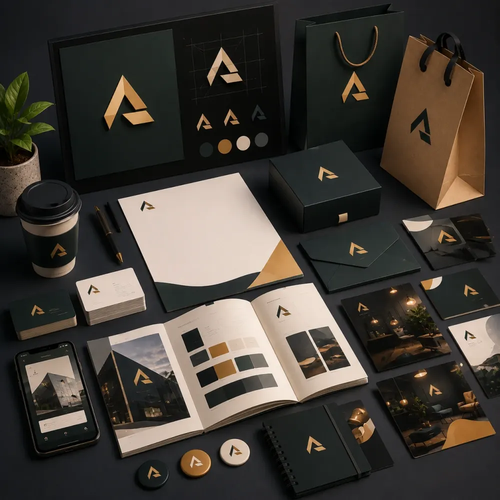
Logo System
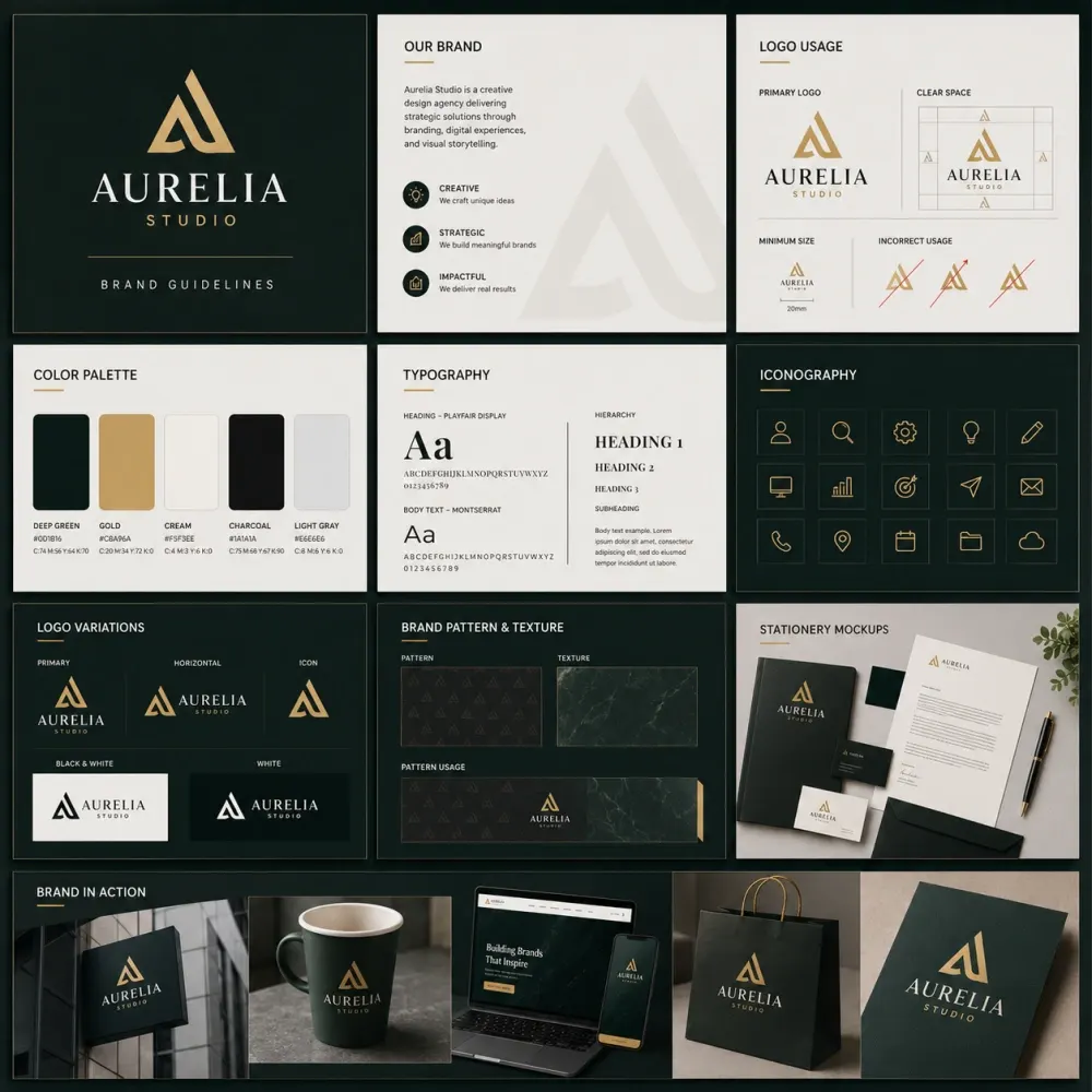
A visual identity needs a logo that works in real situations, not only when it is centered on a large presentation slide. Depending on the project, the system can include a primary logo, secondary lockup, compact version, symbol or icon, monochrome versions and guidance for light or dark backgrounds.
A digital-first startup may need a compact app or social icon. A product business may need a mark that remains clear on small packaging. A professional services company may need a horizontal lockup that fits proposals and document headers. We consider those applications while developing the core identity.
Color Palette
Color can become one of the fastest recognition signals a brand owns. We build a primary and supporting palette around the personality, category and practical requirements of the business. The system can include core colors, secondary colors, neutrals and approved combinations.
Usability matters as much as appearance. A color that looks exciting in a mood board may not work for long text, small interface elements or printing. Where appropriate, the final brand guidelines can document screen and print references so teams and vendors have a consistent starting point.
Typography
Typography affects personality and clarity at the same time. A type system needs to feel appropriate for the brand while remaining readable in real content. We define heading and body fonts, weights, hierarchy and supporting rules according to the applications the business expects to use.
For brands with larger teams, font availability and licensing can also influence the recommendation. A beautiful typeface is not useful if everyone responsible for everyday documents has to replace it with something unrelated.
Graphic Elements
Not every brand needs an extensive pattern library. When supporting graphics are useful, we create them to extend the identity beyond the logo. These can include shapes, lines, frames, patterns, icon styles, illustration direction or other repeatable devices.
The strongest supporting elements usually come from something meaningful in the identity, such as the geometry of the logo, the character of the product or the overall positioning. That gives future layouts more consistency without forcing the logo into every empty space.
Photography and Imagery
Photography can become a major part of visual recognition. A brand may need clean product-led images, people-focused lifestyle photography, technical close-ups, architectural imagery or a more editorial direction. We can define the type of imagery and treatment that best supports the identity.
A clear image direction helps new campaigns feel connected even when different photographers, designers or content teams are involved later.
Brand Guidelines Design
Brand guidelines design turns creative decisions into instructions. The guide can explain logo clear space, minimum size, incorrect usage, colors, typography, backgrounds, imagery, supporting graphics and selected examples.
The purpose is not to create a long PDF simply to make a package feel bigger. A useful guide should answer the questions people will genuinely have when they begin applying the identity.