Professional Infographic Design Services

DesignBub creates custom infographics, data visualizations, process graphics, timelines, comparison visuals and report graphics for businesses that need information presented with clearer hierarchy, accurate visual relationships and brand-consistent design.

DataClear Visual Hierarchy
CustomBrand-Focused Design
Multi-FormatPrint, Web & Social
Custom infographic design
Data visualization and infographic design
Information β†’ Visual Story

Structure the message first, then use charts, icons, diagrams and illustration where they genuinely improve understanding.

Infographic Design Overview

Visual communication should make information easier, not simply more decorative.

Numbers, processes and research often become difficult to use when the reader has to search through dense paragraphs or disconnected tables. Our infographic design approach starts by deciding what people need to understand first, then builds a visual order around that goal. The result can support reports, presentations, websites, product communication, sales material, social media and other formats where a clear visual explanation adds value.

01

What Are Infographic Design Services?

Infographic design services turn information into a visual structure that people can understand more quickly. The source can be a report, spreadsheet, survey, process, comparison, timeline, product sheet, research summary, presentation, or a set of approved facts. We review the material, identify the main message, group related information, and decide which parts need text, charts, icons, diagrams, or illustration.

The job is not to decorate every statistic. A useful infographic creates a reading path. The title establishes the subject, each section adds one clear idea, and the visuals explain relationships that would take longer to understand in plain text. The final structure should still make sense when someone sees it for the first time without a designer standing beside them to explain it.

02

Custom Infographic Design

Custom infographic design should reflect the information, the audience, and the brand at the same time. We do not begin with one fixed vertical template and replace the words. A financial summary, healthcare explainer, technology diagram, consumer campaign, and educational visual all need different levels of detail and different visual language.

We review your brand colors, typography, logo rules, illustration style, icon system, and existing marketing material before developing the visual direction. We then decide how much of that identity belongs inside the infographic. The result should feel recognizably yours without allowing brand decoration to compete with the information. Custom work also gives us more control over layout, chart hierarchy, section flow, and the way the final design adapts to print, presentations, websites, or social media.

03

Data Visualization Design

Data visualization design focuses on numerical information and the relationships inside it. A chart should help the reader see a pattern, difference, change, proportion, or distribution more clearly than a paragraph of numbers could.

We select chart types according to the data. Line charts can show movement over time. Bar charts can make category differences easier to compare. Part-to-whole visuals may work when the number of categories remains limited. Tables can still be the better choice when exact values matter more than the shape of a trend. We also review labels, units, scales, legends, and source notes supplied with the project. Visual styling should never make a small difference look dramatic or hide information that changes the meaning of the data.

04

Statistical Infographic Design

A statistical infographic turns a collection of figures into a connected visual story. The strongest number may deserve the opening position, while supporting statistics can appear in smaller groups that explain the wider picture.

We look for logical relationships instead of simply making every percentage large and colorful. Charts can show comparisons, icons can identify categories, and short explanatory lines can give a number the context it needs. We also keep visual scale honest. If one value is only slightly higher than another, the graphic should not suggest a huge difference through unrelated size changes. This type of infographic works well for survey findings, annual summaries, industry reports, campaign results, research highlights, and internal performance communication.

05

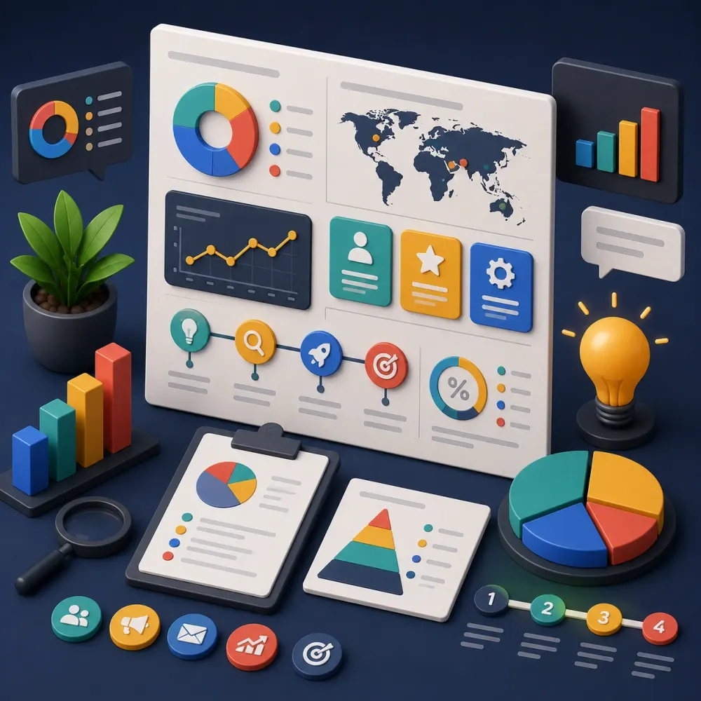
Process Infographic Design

Process infographic design explains how something moves from one stage to another. Businesses use it for onboarding, service delivery, implementation, production, approvals, customer journeys, training, and technical workflows.

We first map the actual process. Some processes are linear, while others include decisions, loops, parallel actions, or handoffs between teams. The visual structure should reflect that reality. We may use numbered stages, arrows, swim lanes, paths, decision points, or grouped blocks depending on the information. The reader should understand where to begin, what happens next, and what the outcome is. Clear sequencing matters more than decorative arrows, especially when the process will be used in a proposal, report, manual, website, or presentation.
06

Timeline Infographic Design

Timeline infographic design presents events, milestones, progress, or history across a clear sequence of dates. It can support company histories, project roadmaps, product evolution, research developments, event schedules, and long-term plans.

We organize dates consistently and decide which milestones need stronger visual emphasis. A long history may work better when divided by year, decade, phase, or another meaningful period. Selected images, icons, or short descriptions can support important events without turning each milestone into a full paragraph. If too much information is placed on the timeline, the visual becomes harder to follow than the source material. We therefore help reduce each entry to the amount of information that the chosen size and format can comfortably support.

07

Comparison Infographic Design

Comparison infographics help readers evaluate two or more products, services, plans, methods, or categories. They work best when equivalent information appears in equivalent positions.

We can use columns, rows, checkmarks, feature groups, charts, or side-by-side sections depending on what needs to be compared. The criteria should remain consistent so the visual does not create an unfair impression by giving one option more detail than another. This format can support service packages, product features, before-and-after examples, methodology comparisons, market differences, or educational content. We also consider the final screen or page size. A wide desktop comparison can become difficult to read on a phone, so a mobile or carousel adaptation may need a different arrangement.

08

Product Infographic Design

Product infographic design combines product visuals with information that helps customers understand features, dimensions, materials, usage, compatibility, components, or benefits. These graphics are useful on ecommerce pages, marketplace listings, catalogs, sales sheets, and presentations.

Accuracy matters because the design can influence a buying decision. Product dimensions, materials, performance statements, certifications, technical specifications, and included accessories should come from approved business information. We organize and visualize those details but do not invent features to make the product appear more capable. When a company sells several related products, we can create one repeatable visual system so every product infographic uses the same hierarchy, callout style, icon treatment, and information structure.

09

Marketing Infographic Design

Marketing infographics can support content campaigns, lead generation, sales material, reports, thought leadership, and brand education. They may explain a customer problem, summarize research, compare approaches, present industry statistics, or lead the reader toward a service.

We balance useful information with commercial purpose. If the visual feels like an advertisement before it provides value, the audience may stop reading. If it contains strong information but never connects the topic to the brand, it may fail the campaign goal. We structure the content so the reader receives a clear takeaway while the logo, brand style, and call to action remain visible in the right places. This creates marketing collateral that can educate and promote without confusing those two jobs.

10

Social Media Infographic Design

Social media infographic design needs stronger hierarchy because people usually see the content on a smaller screen and may scroll quickly. Long paragraphs and tiny charts rarely work well in that environment.

A complex topic may need a carousel instead of one extremely tall graphic. Each slide can focus on one statistic, step, insight, or comparison while the complete set uses the same visual system. We plan text size, safe areas, chart simplicity, cover messaging, and the final call to action around the selected platform. Social adaptations can be created from a larger approved infographic, but they often need more than a simple crop. The information may need to be rearranged so each frame remains understandable on its own and still contributes to the full story.

11

Presentation Infographic Design

Presentations benefit from infographics when a slide contains more information than a normal bullet list can communicate comfortably. We can turn selected slides into processes, timelines, comparisons, charts, diagrams, and visual summaries.

Presentation graphics need to work at distance as well as on a laptop. We keep text concise, labels clear, and the main takeaway visible quickly. A chart that works inside a report page may need larger type and fewer details on a presentation screen. We can design individual visual slides or a connected set that follows an existing presentation system. If the client needs fully editable PowerPoint elements, we define that requirement before production because presentation-native editing can require a different build process from vector artwork.

12

Report Infographic Design

Reports often contain research, performance data, findings, and recommendations that deserve a clearer visual layer. Report infographics can appear as an executive summary, a key-number spread, or individual charts and diagrams throughout the document.

We keep these graphics consistent with the publication instead of designing each one as an unrelated poster. Repeated chart rules, color meanings, labels, source notes, icon styles, and spacing help the reader move from one section to another. When a report contains many visualizations, we can establish a reusable system before applying it across the full document. This makes the final publication easier to scan and gives the organization a more coherent way to present information across annual reports, research papers, corporate profiles, and internal documents.

13

Infographic Content Structure

The quality of the source content has a direct effect on the quality of the infographic. Before we design, we identify the core message, separate primary points from supporting details, group related facts, and remove avoidable repetition.

This stage may involve shortening headings, moving a conclusion, turning a list into categories, or matching each statistic with the explanation it needs. We can restructure supplied content for visual communication within the agreed scope. Deep research, original data collection, specialist technical writing, or extensive copywriting can be quoted separately when the client has not provided usable source material. Design should not be used to hide missing information. A strong visual needs a clear and trustworthy content foundation.

14

Data Accuracy and Source Handling

Infographics can look authoritative, so source handling deserves attention. We work from data, claims, references, and source notes supplied or approved for the project.

During layout, we may notice obvious problems such as inconsistent percentages, missing labels, or totals that do not appear to match. We can flag those issues, but infographic design is not automatically an independent research or fact-checking service. The client remains responsible for approving factual, medical, legal, financial, technical, and other specialist information before publication unless a separate verification scope has been agreed. When citations matter, we can create a clear source area and keep references linked to the information they support. Visual polish should never replace factual review.

15

Brand Consistency in Infographic Design

An infographic can contain more charts, icons, and illustrations than a normal marketing asset, but it should still belong to the same brand. We use approved typography, colors, logo rules, graphic elements, and visual tone where those standards exist.

We also avoid over-branding. A large logo in every section can make the content feel promotional and distract from the information. Brand recognition can often come from the color system, type hierarchy, icon language, and layout style. When a business plans a series of infographics, we can create repeated design rules so future visuals feel related even when the subjects change. This helps the organization build a recognizable information-design style instead of starting from a completely different visual direction each time.

16

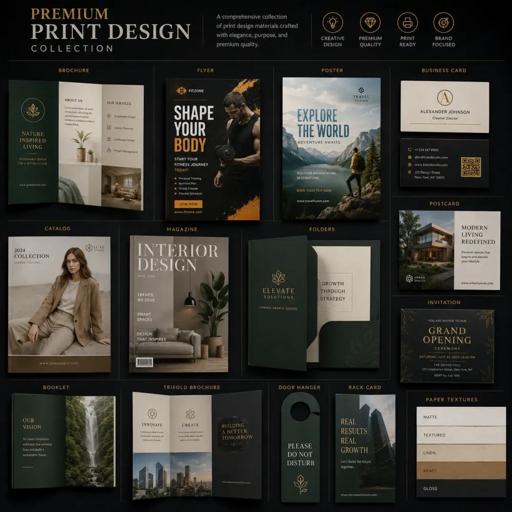
Infographic Design for Print

Print infographics need to work at a defined physical size. We consider page dimensions, viewing distance, bleed, safe areas, image resolution, color mode, and the amount of detail the final size can support.

An A4 report page cannot carry the same label size and information density as an exhibition panel. Large-format graphics may allow more content, but viewers may stand farther away. If the project contains small source notes or detailed charts, we test readability against the planned output. The selected printer should confirm final production requirements, especially for custom materials or large-format work. We can prepare print-ready artwork around supplied specifications while keeping the communication hierarchy clear and the source graphics organized.

17

Our Infographic Design Process

We begin with the source material and the audience. You provide the approved text, data, research, source notes, brand assets, required dimensions, and intended use. We identify the main takeaway and decide how the information should be grouped.

Next, we create the information hierarchy and rough visual structure. Once the sequence works, we develop the design system for charts, icons, typography, colors, and illustration. You review the first design direction and provide focused feedback. We refine the selected approach within the included revision rounds. Before delivery, we check labels, data presentation, spacing, visual consistency, dimensions, and export quality. If the project needs several platform versions, we adapt the approved master after the core information design is settled.

18

What We Need Before Starting

A clear source package makes infographic production faster and reduces the risk of transcription mistakes. Send the final text, approved statistics, source links or citations, spreadsheet data, logo files, brand guidelines, preferred dimensions, target platform, and required file formats.

If the infographic comes from a longer report, mark the findings that deserve priority. Structured spreadsheets are better than screenshots when the project includes many numbers. If custom illustration is required, explain the subject and preferred visual style. For print work, share the printer specifications. For website use, tell us the expected display width and whether a developer needs SVG or separate visual assets. We also need to know which content is final and which parts may still change during the design stage.

19

Infographic Design Cost

The infographic design cost depends on the amount of information and the level of visual development required. A short process infographic with simple icons needs less work than a research-led visual containing several charts, custom illustrations, source notes, and multiple platform versions.

Pricing can change with the number of sections, charts, diagrams, custom icons, illustrations, concept directions, revisions, source-file requirements, and size adaptations. Research, original copywriting, data cleanup, interactive development, animation, and specialist fact verification may require separate scope. We therefore price the actual communication problem rather than charging only by pixel height or page size. The package should make clear what content volume and final formats are included before design begins.

20

Why Work With an Infographic Design Company?

An infographic design company should understand information hierarchy as well as visual style. The designer needs to know when a chart is useful, when a diagram is clearer, how type behaves at small sizes, how data relationships should be represented, and how the visual will be used after approval.

A polished design can still fail if readers cannot understand the order, labels become too small, or a chart gives the wrong impression. Professional infographic design connects aesthetics with communication. It also creates a more practical handoff for marketing teams, printers, developers, or presentation teams that need to use the asset later. The final piece should make the source information easier to understand rather than simply making it more colorful.

21

Choosing an Infographic Design Agency

When comparing an infographic design agency, ask how the team handles content before visual styling begins. Ask whether the price includes information restructuring, custom charts, icons, illustration, source-note placement, and editable files.

You should also know how many initial directions and revision rounds are included. If the same information is needed for print, social media, presentations, and websites, ask whether those adaptations are separate deliverables. Research and data verification should be defined clearly rather than assumed. These questions make quotations easier to compare and reduce scope confusion later. A strong provider should be able to explain both the creative process and the practical limits of what can be visualized accurately from the material you provide.

Infographic Design Pricing

Choose a package based on information depth, not just canvas size.

These prices cover DesignBub’s design work. Research, specialist fact-checking, interactive development, animation, printing and third-party production are separate unless a quotation specifically includes them.

Essential

Essential Infographic

Starting at$299

For a focused process, comparison, timeline, product explainer or short data story.

  • Up to 6 content sections
  • Up to 2 simple charts or diagrams
  • Brand colors and typography
  • One primary format
  • Print-ready PDF or web-ready export
  • Editable source file
  • 2 revision rounds
Discuss Essential Package
Advanced

Infographic Campaign System

Starting at$499+

For research, corporate reports or campaigns that need multiple visual formats and deeper data treatment.

  • Up to 18 content sections
  • Up to 10 charts or diagrams
  • Custom icons and selected illustrations
  • Up to 3 final format adaptations
  • Source-note and citation layout
  • Organized editable master files
  • 4 revision rounds
Discuss Advanced Package

Infographic package comparison

ScopeEssentialProfessionalCampaign System
Content sectionsUp to 6Up to 10Up to 18
Charts / diagramsUp to 2Up to 5Up to 10
Custom icon treatmentBasicIncludedExpanded
Format adaptations1 primary format1 extra formatUp to 3 formats
Editable sourceIncludedIncludedIncluded
Revision rounds234

Optional add-ons

Additional chart or diagramfrom $75
Custom illustrationfrom $150
Social carousel adaptationfrom $150
Presentation adaptationfrom $200
Additional format or sizefrom $75
Research or data cleanup supportfrom $200
Rush scheduling+30%

Important: package limits assume the client supplies approved source content and usable data. Complex research, data analysis, copywriting, medical/legal/financial verification, interactive development, animation, printing, mounting and other production costs are quoted separately when required.

Infographic Design FAQs

Questions clients usually ask before an infographic project begins.

These answers clarify content responsibility, charts, formats, source files and what the standard design scope covers.

The scope can include content organization, visual hierarchy, layout design, typography, charts, diagrams, icons, brand styling, source-note placement, revisions and final exports. The exact mix depends on the package, the complexity of the information and the formats you need.

Yes. We can use an approved report as the source and build the infographic around selected findings, statistics, processes or recommendations. If the report contains more information than one visual can support, we help prioritize the sections that matter most.

Yes. We can design charts and diagrams from supplied data and choose visual formats that match the relationship being shown. The client should review and approve the final values, labels and source information before publication.

Yes. Long-form infographic design can combine several sections, charts, processes, timelines and supporting visuals in one connected layout. The final length and price depend on information density, custom artwork, chart count and the number of output formats.

Yes. We can adapt approved information into single social graphics or carousel layouts. Social versions usually need larger typography, shorter sections and a different sequence than a report or website infographic, so they are treated as format adaptations rather than simple crops.

Yes. We can create presentation-ready charts, diagrams, timelines and visual summaries. If you need fully editable PowerPoint elements instead of placed artwork, tell us before the project starts because that requirement can change the production method and scope.

Research and independent fact verification are not automatically included in standard infographic design. We normally work from client-supplied or approved information. Research, data cleanup, copywriting or specialist verification can be added when the project needs them.

Editable source files are included in the packages listed on this page. The exact software format depends on how the artwork is created. Any special handoff requirement should be confirmed before production so the files can be organized correctly.

Yes. We can apply approved brand colors, typography, logo rules, icon styles and other visual standards while protecting information clarity. If a guideline rule makes a chart difficult to read, we discuss a practical solution rather than silently changing the brand system.

Yes. Depending on the selected package, we can prepare print-ready and web-ready versions or adapt the approved master into additional formats. Printing, interactive development, animation and third-party production remain separate unless they are specifically included in the quotation.

Turn Your Information Into a Visual People Can Follow

Send us the approved content, data, sources, brand guidelines, required dimensions and target platform. DesignBub can organize those inputs into a clear infographic, data visualization or multi-format visual system built around the real communication goal.