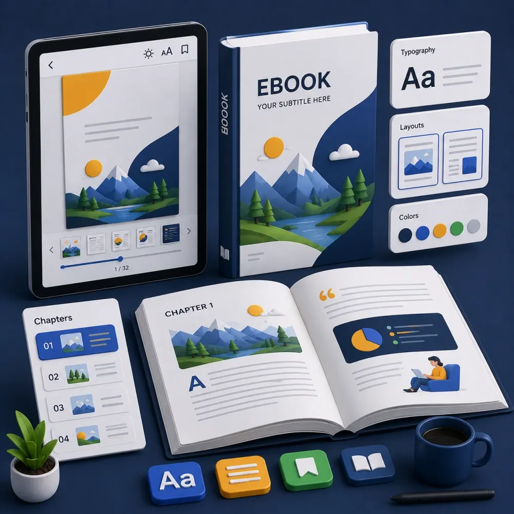
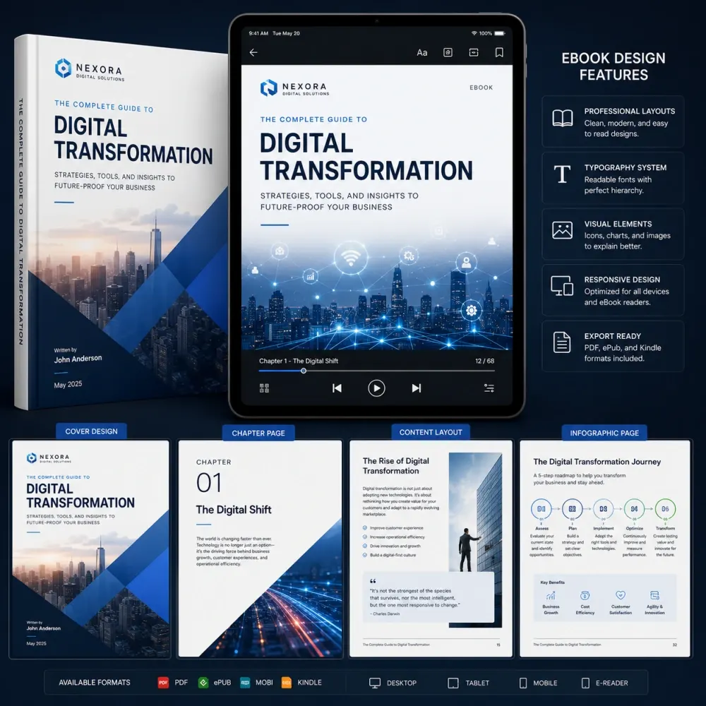
Ebook Design OverviewA good digital book should feel considered on page one and still feel organized sixty pages later.
An ebook can contain useful writing and still be difficult to use. Headings may shift from one chapter to the next. Paragraphs may run too wide for comfortable screen reading. Charts can be dropped into pages without enough explanation. A lead magnet may look like a Word file with a logo added before export. A long guide can become frustrating when the contents page is not linked and the reader has no easy way to return to a section.
DesignBub provides ebook design services for authors, companies, consultants, agencies, educators and brands that want long-form digital content to feel deliberate rather than improvised. We work on business ebooks, lead magnets, branded guides, reports, whitepapers, workbooks and other digital publications. The project can include the cover, interior page system, visual hierarchy, diagrams, links, PDF export, EPUB formatting and editable source files depending on what is actually needed.
We start with the manuscript and the reading situation. A downloadable marketing PDF behaves differently from a reflowable EPUB. A workbook needs room for action. A research report may rely on tables and citations. A Kindle file has to adapt to different devices. Once the use is clear, the design system can be built around that reality instead of around one attractive mockup.
Ebook Layout Design
Consistency gives the reader a map, while variation keeps the publication from feeling mechanical.
A strong ebook layout design establishes predictable relationships. The reader learns what a chapter opener looks like, how a pull quote behaves, where captions sit and how a new section begins. That recognition reduces the amount of visual work the reader has to do as the document becomes longer.
Consistency does not require every page to look identical. A full-page statement can create a pause. A data-heavy spread can become more structured. A chapter introduction may use more space and a larger visual idea. Those differences are useful when they follow the logic of the content.
Real copy matters during design. Templates built only with short placeholder paragraphs can fail once the actual manuscript arrives. We prefer to work with the genuine headings, paragraphs, images and tables as early as possible so the layout is tested against the document that will be delivered.
For long publications, we also plan how the system handles awkward cases: a very long heading, an oversized table, a chapter with almost no imagery or a callout that expands after editorial review. A design system should survive those normal variations without needing to be reinvented page by page.
Typography & Reading ComfortSmall typographic decisions repeat hundreds of times in a long document.
Body text, line length, line spacing, paragraph rhythm and heading hierarchy all influence how comfortable an ebook feels. A typeface that looks impressive on a cover may be unsuitable for several thousand words of continuous reading. We separate display typography from reading typography when the publication benefits from that distinction.
Page proportions also affect readability. A wide landscape guide may work well for screenshots and comparison tables. A narrower portrait document may feel more natural for a text-led publication. A mobile-first lead magnet may need a different page strategy from a report intended for desktop review.
Font licensing is another practical consideration. A typeface that can be used in ordinary graphic design may have different conditions for embedding in digital files. When the final format requires embedding, the chosen fonts and licenses should support that use. Where a client has existing brand fonts, we assess how well they work in long-form reading before applying them everywhere automatically.
Business Ebook Design
Long-form brand content needs more than a logo in the corner of every page.
Companies use ebooks for customer education, thought leadership, product guidance, sales enablement and lead generation. These documents often contain a mixture of prose, statistics, quotes, examples, screenshots, diagrams and next-step sections. The visual system needs to accommodate all of those content types without making the publication look like several different documents stitched together.
Branded ebook design uses the identity as a framework rather than as a repeating decoration. Color, typography, image treatment, icon style and spacing can make the publication feel unmistakably connected to the business without placing an oversized logo on every spread.
We also consider how the ebook will be distributed. A file downloaded after a form submission may need a stronger opening and clear CTA at the end. A customer guide may need direct navigation to specific topics. A report sent to stakeholders may need restrained data presentation and easy reference. The design changes with the job the ebook is expected to perform.
Lead Magnets & GuidesA lead magnet should reward the download before it asks for the next action.
A person who opens a lead magnet has already given the brand attention and often contact information. The publication should therefore make the useful part easy to find. Clear headings, checklists, short examples, diagrams and summaries can make educational material easier to consume without reducing it to shallow promotional copy.
Lead magnet design can also create a sensible path to the next step. The final section might invite the reader to book a consultation, use a service, review another resource or contact the company. That CTA should connect with the content that came before it. Design can make the action visible, but it cannot guarantee lead volume, downloads or conversions.
For recurring campaigns, an editable ebook template can also be useful. Instead of rebuilding a new PDF from scratch every month, the team can reuse approved chapter patterns, quote styles, data blocks and CTA sections. The template should be flexible enough for genuine content changes while still protecting the core brand structure.
Whitepapers & Reports
Dense information becomes easier to trust when the page helps the reader inspect it.
Whitepapers and research reports are usually more information-dense than marketing ebooks. They may include methodology, charts, footnotes, references, definitions and sections that need to be compared carefully. The design should support that reading behavior rather than attempting to turn every page into a dramatic campaign visual.
Charts and tables are restyled for consistency while keeping the supplied values, labels and context intact. A chart should make a pattern easier to see without exaggerating the data. A table should remain readable enough to inspect individual values when those values matter.
Claims, research findings, citations and source accuracy remain the responsibility of the content owner. DesignBub can organize approved information and make it more legible, but visual treatment does not verify the underlying research. Where substantial editorial review or fact checking is required, that work should be scoped separately.
Images, Charts & DiagramsVisuals should shorten the path to understanding, not simply fill empty space.
Images can add context, evidence or atmosphere, but they also affect file size and layout behavior. A fixed PDF can position images precisely, while a reflowable EPUB needs more flexible image treatment. We size and place visual assets according to the format rather than using one image treatment everywhere.
Custom diagrams can be useful for processes, frameworks, comparisons and systems that take too long to explain in paragraph form. Not every statistic needs a full infographic, however. Sometimes a strong number with a short explanation is clearer than a decorated chart.
Client-supplied photography, screenshots and illustrations can be integrated into the publication. Licensed stock imagery or new illustration can be added when included in the project scope. Image rights should be suitable for publication use, and very low-resolution source files may need replacement rather than enlargement.
Interactive PDF Features
Interaction is useful when it removes friction from a long document.
An interactive PDF can include a linked contents page, internal jumps between sections, website links, email links and buttons to external resources. Those features can make a long digital guide much easier to navigate, especially when readers are likely to return to specific topics rather than read from beginning to end every time.
We keep important information understandable even when the file is opened in a reader with limited interactive support. A critical instruction should not depend entirely on a hover state or feature that only works in one application.
For reflowable EPUB, navigation is connected to the document structure itself. Heading hierarchy, contents data and chapter organization need to be built correctly so the reader can move through the book naturally on different devices.
Ebook Cover DesignThe cover has to work as a full image and as a thumbnail smaller than a phone icon.
The title needs to remain recognizable when the cover is reduced. Detailed backgrounds, thin typography and subtle contrast may look impressive at full size but disappear in a marketplace grid, email preview or social post.
We consider title hierarchy, subtitle, author or brand name, imagery and the type of publication before developing the cover. A business guide may need clear subject recognition. A consumer ebook may need stronger category or genre signals. A research report may need a more restrained editorial approach.
If the publication may later become a printed book, that should be mentioned before the cover is finalized. A print cover can require a spine, back cover, trim size, bleed and printer-specific setup that an ebook-only cover does not require.
Workbook & Educational Ebook Design
Documents that ask the reader to do something need space designed for action.
Workbooks can include exercises, prompts, tables, planning pages, checklists and templates. The amount of response space should reflect the task. A question that asks for a paragraph should not be followed by a tiny single-line box simply because the page looks tidier that way.
For printable workbooks, margins and practical writing areas matter. For digital workbooks, the interaction method needs to be agreed before design begins. A standard PDF, fillable PDF and editable document are different deliverables and may require different preparation.
Educational ebooks can also combine explanation with activities. We use clear recurring treatments for examples, warnings, exercises, answers and recap sections so readers learn the visual language of the document as they progress.
Navigation & StructureThe longer the ebook becomes, the more valuable a clear route through it becomes.
A ten-page guide may be easy to scroll from start to finish. A large publication needs stronger navigation. A table of contents helps readers understand the shape of the book and, when linked, move directly to the section they need.
Chapter headings and subheadings should follow a logical hierarchy. For PDF publications, bookmarks and internal links can provide another layer of usability. For EPUB, the structural hierarchy supports the reading system and navigation features provided by the device or app.
Navigation also helps people return to useful information later. Many business ebooks are not read only once. A clear structure turns the file into a reference resource instead of a document that becomes difficult to revisit after the first read.
Final Handoff
The delivery should be useful after the designer closes the working file.
Depending on the project, final deliverables can include a screen-ready PDF, ebook cover, editable source file, EPUB, Kindle-oriented file, cover thumbnail, selected promotional page exports and print adaptation. The agreed formats are listed before production so there is no confusion at handoff.
Editable source files can be important when a business expects regular updates. However, some typefaces, stock imagery, plugins or third-party resources may have separate licenses that cannot simply be transferred. Those dependencies should remain visible rather than being hidden inside the file.
For platform publishing, DesignBub can prepare the design and formatting output included in scope. Account setup, rights declarations, metadata choices, taxes, distribution settings and final marketplace approval remain under the publisher's account and the platform's rules.
Why DesignBubLong-form design needs a system strong enough to survive the pages nobody puts in the portfolio mockup.
A polished cover is important, but the middle of the publication matters too. A weak heading hierarchy becomes frustrating after six chapters. One badly planned table can disturb several pages. A page style that only works with short text breaks when the manuscript includes a longer explanation.
DesignBub approaches ebook design services from the reader's side as well as the brand's side. We look at how the file will be opened, how information repeats, where navigation matters and which content deserves visual emphasis. We also keep the output format in view from the beginning, because a fixed PDF, reflowable EPUB and Kindle file should not be treated as interchangeable containers.
The goal is not to make every page shout for attention. It is to give the publication a visual rhythm that helps the reader keep going, return to useful sections and understand the information without fighting the layout.