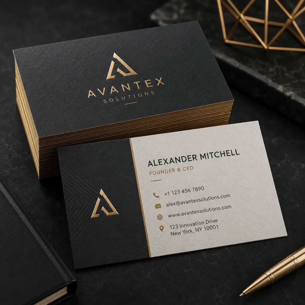
Essential Business Card
A focused card for one professional using an existing logo and brand direction.
- 1 custom design direction
- Front + back layout
- 1 person / contact set
- Print-ready PDF
- Editable source file
- 1 presentation mockup
- 2 revision rounds
">
DesignBub creates custom business cards for professionals, founders and teams that need clear contact details, strong brand alignment and practical print-ready artwork. We plan the layout for the real card size, not only for an attractive screen mockup.


Built around real contact information, readable typography, brand consistency and printer-ready setup.
Business card design services cover the planning, visual design, refinement and production preparation of professional contact cards for individuals and organizations. A project can involve one card for one person or a reusable system for a full team. The final layout may include a logo, name, role, phone number, email address, website, office address, social handle, QR code or other details that serve a clear purpose. We decide what deserves space before we start styling the card.
The physical format changes the design decisions. A horizontal card, vertical card, folded card or custom size creates different limits for text and spacing. We also consider whether the card will use one or two sides, standard printing or a specialty finish. Professional business card design should make the information easier to use while keeping the visual identity recognizable. A card is small, so every item needs a reason to be there.
Digital contact sharing is common, but a printed card still works well in meetings, exhibitions, property visits, clinics, showrooms, networking events and sales conversations. It gives the other person something physical to keep after the conversation ends. That does not make every business card effective. A crowded card, tiny text or weak hierarchy can make the information harder to use than simply typing a phone number into a mobile device.
A professional design creates order. The recipient can quickly see who the card belongs to, which company the person represents and how to make contact. The card can also reinforce the same logo, colors and typography already used on the website, stationery, packaging or signage. This consistency helps the business present one identity across different touchpoints without forcing every printed item to look exactly the same.
Custom business card design starts with the brand rather than a ready-made template. We review the logo, color palette, typefaces, graphic elements and overall personality before deciding how the card should look. A financial company may need a controlled and conservative layout. A creative studio can support a more expressive composition. A luxury brand may rely on spacing, material and typography rather than adding more visual elements.
Custom does not mean complicated. A card can feel specific to a business through small decisions such as logo scale, alignment, type hierarchy, color placement, icon style and the relationship between the front and back. We aim to create a layout that feels intentional at the real printed size. The card should look like part of the company, not a generic design with a different logo dropped into it.
The strongest business cards usually make one or two things obvious first. In many cases, the person’s name and company identity lead the hierarchy. The role, phone, email, website and address follow in a quieter level. We group related details so the reader does not need to search across the card. Contact icons can help when they remain simple, consistent and large enough to print clearly.
Hierarchy also controls visual weight. A very large logo can overpower the person’s details, while a tiny logo may lose recognition. Long email addresses can create awkward line breaks. Multiple phone numbers can make the card busy. We balance these practical issues before adding decoration. The result should communicate in seconds because most people will not study a business card like a brochure.
Corporate business card design often needs a system rather than one finished file. Directors, managers, sales staff and other employees may all use the same card structure with different names, roles and contact details. We can create a master layout that controls typography, spacing, logo placement and information order, then prepare the agreed employee versions from that system.
A master approach makes future updates easier. The company does not need to redesign the card when a new employee joins. It only needs the correct personal data placed into the established layout. For larger teams, a structured spreadsheet can reduce mistakes in names, titles, phone numbers and emails. Multi-office companies can also use controlled location variants when different addresses or contact details need to appear.
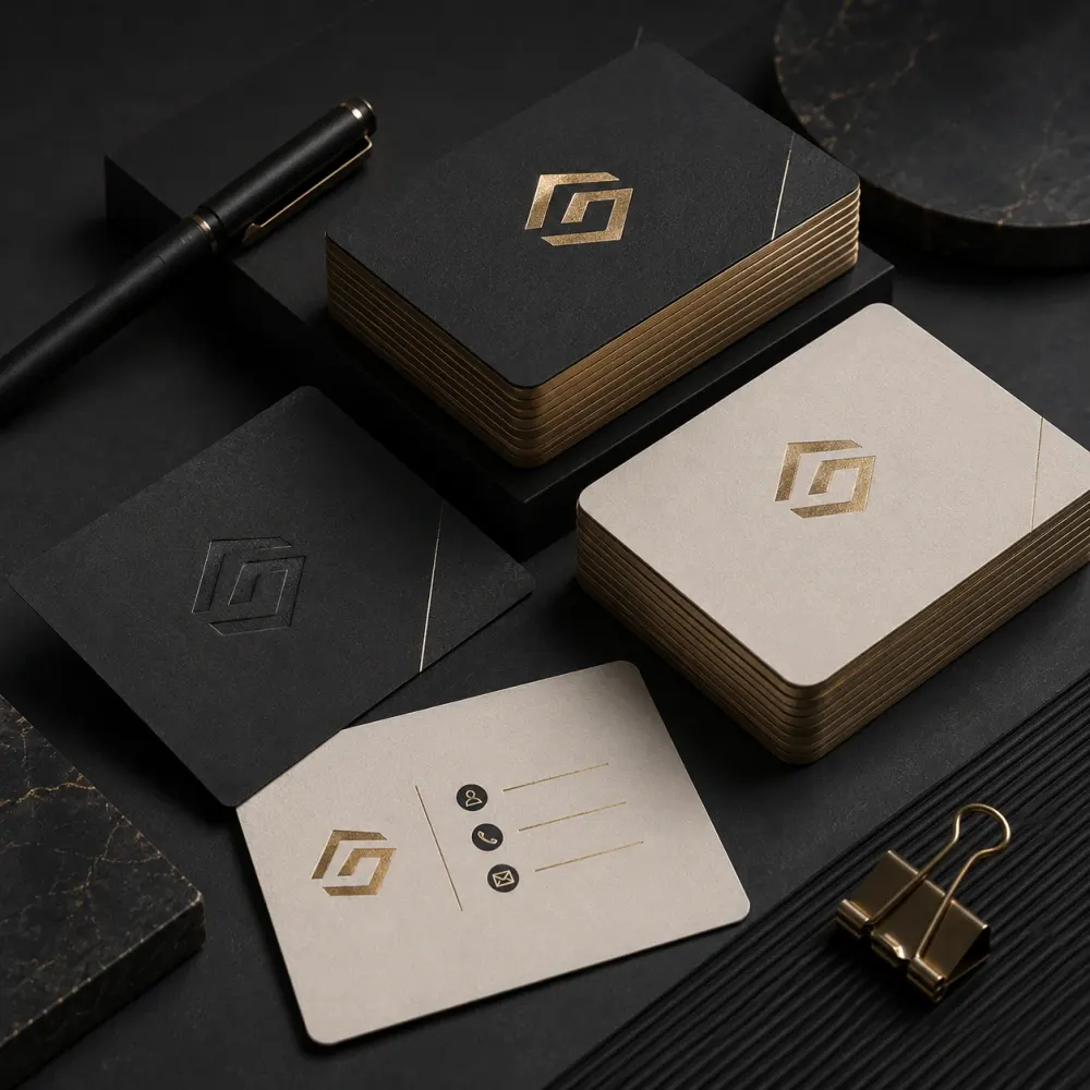
Luxury business card design usually works best when the design and production method support each other. A premium result can come from disciplined typography, generous spacing, strong paper stock and one carefully chosen finish rather than several competing effects. Foil, embossing, debossing, letterpress, edge coloring, textured stock or spot UV can all influence the visual direction when the selected printer supports them.
Special finishes need production planning. A foil area may require a separate artwork layer. Embossing needs enough space and suitable detail. Very thin lines may not reproduce as expected with some processes. We can prepare design artwork around an intended finish, but the printer should confirm materials, minimum sizes, tolerances and manufacturing feasibility before production. The mockup can communicate the idea; the printer controls the physical result.
Minimal business card design uses fewer elements, so typography and spacing become more important. A clean logo, a clear name and carefully grouped contact details can create a stronger impression than a card filled with decorative lines, icons and slogans. Minimal does not mean unfinished. The composition still needs balance, contrast and enough structure to guide the eye.
This direction suits brands that already have a strong identity or want a restrained professional look. It can use black and white, a limited brand palette or one accent color. We keep text readable and avoid making type so light or small that it disappears in print. A minimal card should feel calm and deliberate at normal viewing distance, not empty because important information was removed without a plan.
Creative business card design gives brands more room to express personality through typography, patterns, illustration, unusual composition or carefully planned custom formats. This can suit designers, architects, photographers, restaurants, fashion labels, event businesses, entertainment companies and other brands where visual character forms part of the service or product.
Creativity still needs to support communication. The phone number should remain readable. The logo should not become unrecognizable. The card should still fit the selected printer’s technical limits. We avoid using an unusual shape or visual trick only because it looks different in a mockup. The strongest creative concept connects to the brand and still works when someone takes the card out of a wallet several weeks later.
Visiting card design is another common term for professional business card design. The practical goal remains the same: identify the person or company and provide useful contact information in a compact printed format. We can design visiting cards for business owners, executives, consultants, doctors, engineers, lawyers, real estate professionals, restaurant teams, retail staff and many other roles.
The information should reflect the situation. A medical professional may need clinic details. A property consultant may prioritize mobile and WhatsApp. A company director may need office numbers, email, website and address. We do not fill every card with the same fixed list. We choose the details that help the recipient take the next step and organize them so they remain easy to scan.
A double-sided business card gives the layout more room to separate branding from contact information. One side may focus on the logo or a strong brand element while the other presents the person’s details. This often creates a cleaner result than forcing everything onto one side. The second side can also support a QR code, short tagline, website, appointment note or selected service information when those details are genuinely useful.
Two sides should improve organization rather than double the amount of content. We decide which information deserves the front and which information can move to the back. The two sides also need a visual relationship so the card feels like one piece. Consistent typography, color and spacing help both sides work together even when one side is deliberately much simpler than the other.
These prices cover DesignBub’s design and artwork-preparation work. Printing, paper stock, specialty finishing, delivery and other supplier charges remain separate unless a custom quotation says otherwise.
A focused card for one professional using an existing logo and brand direction.
More concept choice and useful variants for a business that wants a stronger presentation.
A reusable master card system for companies that need several employee or office versions.
| Included | Essential | Professional | Card System |
|---|---|---|---|
| Starting price | $59 | $139 | $169+ |
| Initial design directions | 1 | 2 | Up to 3 |
| Front + back layout | Yes | Yes | Yes |
| Employee versions | 1 | 1 | Up to 5 |
| QR code placement | Optional add-on | Included if required | Included if required |
| Colorways | 1 | Up to 2 | As scoped |
| Editable source | Included | Included | Included |
| Mockups | 1 | 2 | 3 |
| Revision rounds | 2 | 3 | 4 |
Design fee only: printing quantity, paper, lamination, foil, embossing, die cutting, courier charges and other production costs are not included. Specialty finishing is prepared only after the printer confirms its technical requirements.
Vertical business cards can create a distinctive presentation, especially when a logo or monogram naturally works in a tall composition. A vertical format can also suit stacked typography and simple information sets. However, the narrower width changes how long email addresses, websites and company names fit. We check those details at the real trim size rather than assuming a digital preview will solve every spacing issue.
The best orientation depends on the identity and content. If a vertical layout forces important details into tiny type or awkward line breaks, a horizontal card may be more practical. We can compare directions during concept development when the package includes multiple routes. The objective is not to choose a format because it feels unusual; it is to use the format that supports the brand and information clearly.
A QR code can connect a printed card to a website, portfolio, contact page, map, booking system, menu, social profile or another digital destination. Business card design with QR code placement needs enough clear space and contrast for reliable scanning. The code should not be reduced until it becomes difficult for phones to recognize or placed over a pattern that interferes with its structure.
We also consider what happens after the scan. A QR code adds little value if it points to a temporary URL, a broken page or a desktop page that works poorly on mobile. The client should provide the final destination and confirm it before print. When scanning is important to the card’s purpose, we recommend testing a physical proof because print quality, size and finishing can affect real-world performance.
Typography controls a large part of the card’s personality and readability. A display font that works on a website banner may become difficult to read at small print size. Very thin weights can disappear on some stocks or printing methods. We choose sizes, weights, line spacing and letter spacing for the physical format rather than simply scaling down a digital layout.
The name normally receives more emphasis than the supporting details. The job title can sit below it at a quieter level. Contact information needs enough contrast to remain readable without competing with the identity. When the brand uses several fonts, we do not automatically place all of them on the card. A compact format often benefits from a simpler type system that still follows the brand guidelines.
Color helps connect the card to the rest of the visual identity. When approved brand values exist, we use them as the main reference. We also check contrast because a brand color that looks attractive in a large digital area may not provide enough separation for small printed text. Dark cards, light cards and bright cards each create different production and readability considerations.
Printing commonly works in CMYK or a printer-defined color workflow, while screens display RGB light. That means a monitor preview cannot promise a perfect physical match. Paper, ink, lamination and press conditions also affect the result. For color-critical work, the printer may recommend a physical proof. We prepare the artwork around the supplied brand and production values instead of inventing exact print equivalents without verification.
Business card dimensions vary by region and printer. Many cards use a familiar wallet-size format, but no single size works for every supplier. We ask for the final trim size when a printer has already been selected. The production file then needs the correct bleed beyond the trim and a safe area that keeps important details away from cutting tolerances.
Custom sizes can create a distinctive look, but they can also affect printing cost, cutting, storage and wallet compatibility. Folded cards or unusual shapes need even more care because the printer may supply a dieline. We use the production specification as the technical reference. This approach is more reliable than designing at an assumed size and trying to adapt the layout after approval.
Print-ready business card design turns the approved visual direction into files a printer can use. Depending on the supplier, preparation can include final dimensions, bleed, safe margins, CMYK values, high-resolution linked artwork, font handling and a specific PDF or editable format. We can also provide an RGB preview for normal screen viewing when it is part of the agreed delivery.
A print-ready file is still tied to a production workflow. One printer may request PDF/X settings, while another may ask for an editable vector file or its own template. Specialty finishes can require additional separation layers. If the supplier provides instructions, send them before final export. That allows us to prepare the artwork for the actual printer instead of assuming one generic file suits every production method.
An existing card may already contain the right logo and information but still feel dated, crowded or inconsistent. Business card redesign services can improve hierarchy, typography, spacing, alignment, colors and production setup without forcing a complete rebrand. We first identify which elements should stay and which parts are creating the problem.
Sometimes the biggest issue is the source artwork rather than the layout. A low-resolution logo can look soft in print even after the rest of the card improves. In that case, vector recreation may be required before final production. We explain that separately instead of pretending the card design alone can fix an unsuitable source file. The redesign should preserve useful brand recognition while making the card clearer and easier to reproduce.
Our business card design process starts with the brand assets and final information. You provide the logo, name, role, phone number, email, website, address, brand guidelines if available, preferred card size and any printer specification already supplied. We review the amount of content and identify a suitable hierarchy before developing the visual direction.
We then create the concept or concepts included in the selected package. After you choose a direction, we refine typography, spacing, color, icon placement and the relationship between the front and back. You review the details and provide focused feedback within the included revision rounds. Once the design is approved, we prepare the agreed source and print files, plus mockups or team versions where the package includes them.
Please send the exact information that should appear on the card. This normally includes the person’s name, job title, phone number, email, website and any required office address. If the card needs a QR code, provide the final destination URL. If several employees need cards, a spreadsheet with one row per person can make the handoff cleaner and reduce manual copying errors.
We also need the best available logo file and any brand guidelines that define colors or typography. A vector logo is preferred for professional printing. If a print supplier has already been chosen, send its trim size, bleed, safe area, preferred file type and finishing instructions. The client should check all names, titles, numbers, addresses and URLs before final approval because those details come from the supplied business information.
Business card design cost depends on the amount of creative and production work required. A straightforward card using an established brand needs less development than a premium card with several concepts, specialty finishing layers, custom illustration or a large team rollout. The number of employee versions, colorways, QR codes, mockups, source-file requirements and revision rounds can also change the scope.
Printing is separate from the design fee unless a written quotation specifically includes production. Paper stock, quantity, lamination, foil, embossing, die cutting, delivery and other supplier charges depend on the printer. Our pricing focuses on design and agreed artwork preparation so the client can compare creative costs separately from manufacturing costs.
When comparing a business card design agency, check what the quoted package actually includes. Ask how many initial concepts you receive, whether both sides are covered, how revisions work and whether the editable source file is part of the delivery. If you need several employee cards, confirm how many versions are included and how additional names are priced.
Also ask whether the team can follow a printer template, prepare QR code placement, create premium finishing artwork and supply a realistic mockup. These details can make two apparently similar prices cover very different amounts of work. A clear scope helps you understand what you are buying before the first concept is created.
We check the logo, brand direction, contact details, card size and printer requirements.
We build the design direction around hierarchy, typography, spacing and the selected format.
We refine the chosen route from focused feedback within the package revision allowance.
We prepare bleed, safe areas, color setup and finishing layers where they form part of the scope.
You receive the agreed print-ready files, source artwork, mockups and team versions.
The answers below explain scope, files, team versions, QR codes, finishing and production responsibilities.
Most cards need the person’s name, job title, company identity, phone number, email and website. Address, social details or a QR code can be added when they help the recipient. We avoid adding information simply because there is unused space.
Yes. We can build the card around your existing identity. A clean vector logo is preferred for print. If the only available logo is a small or blurry image, vector recreation may be quoted separately before final artwork preparation.
Yes. All three listed packages include front and back design. We decide how to divide branding and contact information so the second side improves organization instead of creating unnecessary extra content.
Yes. QR code placement is included in the Professional and Business Card System packages when required, and it can be added to the Essential package. You should provide the final destination URL and test the printed result before a large production run.
Yes. The package includes print-ready artwork based on the agreed card size and available printer requirements. If your printer supplies a template or special export instructions, send them before final delivery.
Yes. The Business Card System includes up to five employee versions built from one approved master design. Additional names can be added as an add-on, provided the layout and brand system remain the same.
Yes, when the finishing setup forms part of the agreed scope and the printer provides its technical requirements. The printer remains responsible for material choice, tolerances, manufacturing quality and final production.
Yes. Editable source artwork is included in the listed packages. Font licensing still applies, so a client may need appropriate licenses for commercial fonts used in an existing brand system.
The prices on this page cover design and artwork preparation. Printing, paper, finishing, quantity, shipping and other supplier costs remain separate unless a custom quotation specifically includes production.
Timing depends on the number of concepts, team versions, feedback rounds, source-file quality and any specialty print setup. We confirm the schedule with the project scope rather than promising the same turnaround for every card.
Send DesignBub your logo, exact contact details, card size and printer requirements. We can turn them into a clear, branded card that is ready for review and production.