Naqaa Salt
This page documents the selected packaging design work in a case-study format so visitors can understand the design context before reviewing the full visual collection.
A focused DesignBub portfolio case study for Naqaa Salt. Packaging has to balance shelf impact with information hierarchy, legibility, product distinction and production-ready visual consistency.
This page documents the selected packaging design work in a case-study format so visitors can understand the design context before reviewing the full visual collection.
The work is presented around hierarchy, label architecture, color/typography decisions and how the design translates across the package surface.
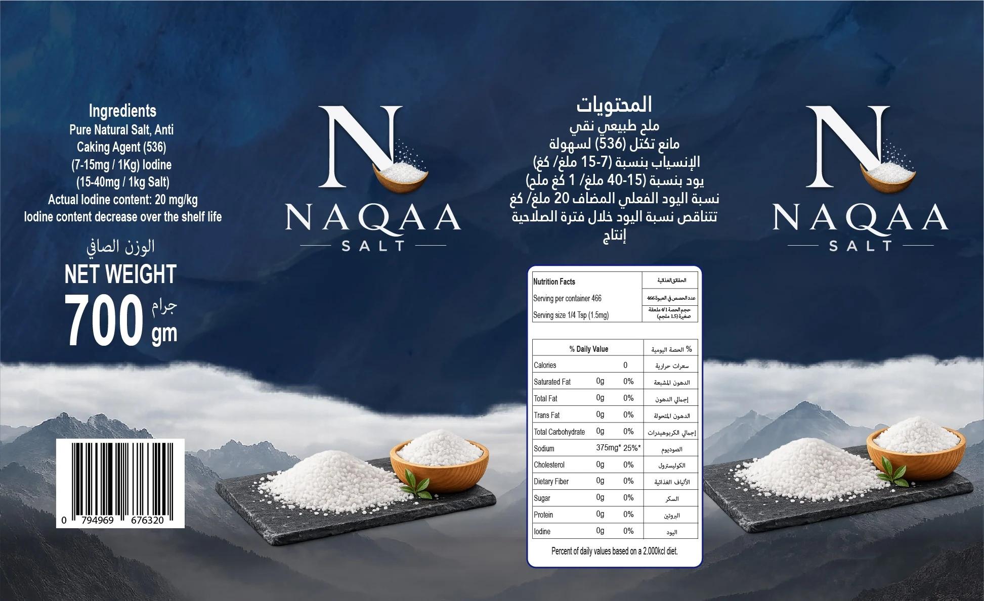
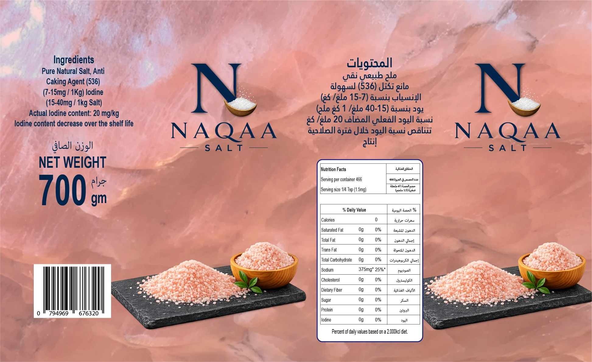
The gallery below presents packaging concepts, artwork and selected package views.
Pink packaging, Mountain packaging, Brand logo
Open any visual for the full-size file. The gallery keeps the original work prominent while captions provide context for each asset.